Flickr

phlyersphan. Get yours at bighugelabs.com/flickr

Sunday, September 30, 2007

First Shot at a Panorama

I had a thought yesterday at the lake - why not try taking a series of shots and test out the photo merge feature in Photoshop CS3? I wasn't in a good location to take a panorama, but figured what the heck - at least it would give me something to try with.

I remembered from reading somewhere that the best way to do it is to get one snap and check the settings, and if everything looks OK, switch to manual mode, using those settings, so that auto modes don't mess up one of your shots (like, auto focus changing, or auto white balance changing, etc). So I did that and fired off 5 overlapping shots.

And let me tell you... I thought CS3 was worth the price of admission for the Quick Select tool, but now after using the Photomerge feature under File - Automate - holy cow. CS3 is a must have!! It's practically one-click. Srsly.

The bad news is, I have discovered a mosquito bite on the palm of my hand from my adventures. Booo.

If the image below is too small for your taste, click for a larger one.

Lake Katherine Panorama

Trip to Lake Katherine

I went to Lake Katherine in Palos Heights, IL yesterday for the first field shooting part of my photography class. It's a beautiful place. I'd like to get back there shortly when more leaves are changing color - maybe try a panoramic shot with Photoshop CS3's photo stitching abilities.

I got to experiment with shooting in shutter priority mode. I didn't have a tripod with me, but I did find an angle I could shoot a waterfall at that had a fence post that I could rest my camera on. There is definitely a difference in the silkiness of water movement, even between 1/4 second shutter speed and 1/25. (Not that I didn't believe all the photography books I've been reading - but it's a whole nother thing to see its effects with your own eyes). So I enjoyed toying around with that. I was looking for good animal shots and landscapes.

My "prized" animal shots are of an encounter I had with a squirrel. None are absolutely perfect, but they each gave me some things to think about next time I'm out shooting. I got one shot where the squirrel is trying to camouflage himself along the tree - but I got the tree in focus instead of the squirrel's eye. I knew it at the time but didn't want to move to change to manual focus point mode or manual focus, because I'm not quite familiar enough with that mode to change it without pulling the camera down from my eye - and I didn't want to miss the shot, so I took what I could.

I took about 250 shots and out of those, I've marked 34 "picks" from which I will try and choose my portfolio shots for class. I suppose how many I choose will depend how many picks I get out of next week's "urban" shoot. We need to choose 9 prints at 4x6 and one at 8x10 to turn in as our portfolio.

Here are the picks (click the picture below to view them on flickr):
You lookin' at me??

Friday, September 28, 2007

Egret in Flight: Take 2

I've got this photo up in the Critique forum over at DPS.

I've added some motion blur to the shore line in the background. I still can't put my finger on what I don't like about this picture. I like the egret, and his pose, and that I can see his head from the angle I shot at. Maybe it's the colors? So drab...

I do like it a bit better with more blur in the background. Here's what I've got so far:

Egret in Flight, Take 3

Back Yard Adventures

Hung out in my back yard around sunset this evening. This is my favorite time of year, weather-wise: 70-ish and just gorgeous. Fall leaves come down too quickly for my taste, and this year I hope to get out and get some photos as things change color. Unfortunately, it's been such a weird late summer/early fall that some trees are losing their leaves without them having changed colors. Kind of bizarre.

In this picture, I was trying to capture the sky, which looked a lot more dramatic in real life than I was able to portray with my camera. I tried various white balance settings, to no avail. I'm facing east, and the sun is setting to the west directly across from my subject. It made some neat colors in the clouds. This shot has been cropped quite a bit, and I cloned out an annoying golf hole flag.

Cool sky

And a semi-low semi-red moon tonight - 98% full, waning gibbous. This wasn't the most crisp shot I got, but it showed the color of the moon the best. The red only lasted a few minutes, and after that it was just like any other moon...

Low red moon

Earlier in the afternoon, I caught a shot of a great egret flying over the pond in my back yard. Unfortunately, I had bumped my camera dial (apparently) and it was set to Manual mode (and the last thing I'd shot was the moon!) - so the shutter speed was way too slow. The photo was grossly over exposed, but I kicked down the exposure 4 stops in Lightroom and then messed with color levels a bit. This is what I got:

Egret - edit

There's some camera shake around his wings, but it looks more like an indication of motion to me than a blur. I cropped the photo a bit, as there was originally more room on the right and I wanted to give the guy some room to fly into. I wish I had been outdoors when I took this shot - I was indoors behind a window. I kind of like it, particularly the position of the bird and the bit of shadow beneath him. I don't much like how the bank of the pond behind him looks.

Here's a question for the masses: are the effects of camera shake acceptable if they add to the movement of the subject in the photo?

(I can't say I'm sure that's the case here, but I think it's at least arguable!)

Monday, September 24, 2007

Digg-ital Art


This is exactly why photography suits me so well; it's just creative enough, and just geeky enough, to make me happy.

See What the Duck

Saturday, September 22, 2007

Photography Class

I started my photography class today. It's a 4-week class called "Film/Digital Camera Skills." I'm excited that we'll get to take some field trips to do some shooting, but am a little disappointed that the content of the class is being delivered from a point-n-shoot/auto-mode perspective. I was hoping to get some practice with manual mode and exposure compensation and stuff like that.

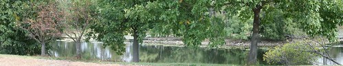
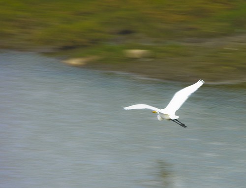
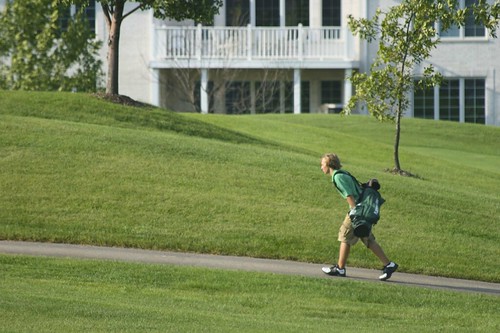
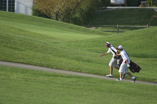
Still, I'll get 8 hours worth of shooting time in the field, split between a nature preserve and an "urban" shoot (which is really set in the downtown portion of a suburban town).

I think the most valuable part of this class, to me, will be in having that dedicated time with my camera, and in reviewing the shots that I take and critiquing my work. I hope to pick up some inspiration, tips, and ideas along the way. It's a *very* beginner-level class, though, which is a bit disappointing.

For example, the instructor mentioned reciprocity, and then explained that it's a complex subject that is far beyond the scope of this class.

Sigh.

We've been told to shoot in the picture modes of our camera - portrait mode, landscape mode, sports mode, etc, and to shoot at ISO400.

Always the rebel... I'm going to shoot in Av, Tv, or manual modes, because that's what I need practice with, and I'm going to shoot at ISO100 unless circumstances dictate otherwise. We'll be shooting in bright daylight (9a-1p), so... rebel rebel!

At the end of the class, we are to turn in 10 prints: nine 4x6 prints and one 8x10 print as our "portfolio."

Most of the students in the class have point-n-shoot cameras. I saw 2 other people with Digital Rebels like mine. It looks like it'll be a very basic class, but I'm glad to at least get that 8 hours of field time to force me to get out and take pictures.

Our instructor is a Canon guy, so at least that bodes well for me if I have any specific questions about my camera!

Monday, September 10, 2007

Photoshop Frame Actions

Recently, I was looking for some information on how to add a decorative border to my photos. Nothing fancy - just a black border... someplace I could possibly put a copyright notice or a web URL.

As usual, the DPS community came to my aid when I posted the Add a Border? thread.

I found that there are lots of free actions out there available for Photoshop that can add a nice border to your photos. I found one that I like, and then recorded my own action to:
1. Run the frame action, then
2. Add a text layer with my name and copyright info

I found Jodi's Multiple Choices Gallery Frame Action at ATNCentral.com. Scroll down a bit from that link to find Jodi's action. I liked it the best, but there are many others you could try! :)

Sunday, September 9, 2007

Goose: Before and After

Let me tell ya... the people at the DPS forums are fantastic! Here's the entire thread on my critique and post-processing of a cat named Goose.

I posted that pic of Goose from the other day for critique on DPS. I knew it could be improved in post-processing, but had no clue what to do next. They gave me some tips, and - holy cow! Goose is one handsome devil :)

Goose - BEFORE:
Goose

Goose - AFTER:
Goose - After, Take 2

Much improved, no?? I think so!!

The greatest part is, I had no clue how to do the things they had suggested, so I had to look it all up... I learned a ton just from messing with this one picture of Goose!

Here's what I did:
First, I worked on the blur on the background. I never knew you could feather a selection - so I feathered it at 30px around the top of his head and body to prevent that unnatural line I was getting before. I did a lens blur, and pretty much maxed out all of the blur values. I also de-saturated that area and darkened it a bit.

Next, I learned how to use the quick mask tool to make a selection out of the inside of his eyes, and then I just increased the brightness there (which amazingly brought out the green in his eyes! I was shocked - I had no idea that could be done!)

Then, I upped the yellows and reds in the whole picture to warm up Goose's browns a bit. I was really unsure here - I'm not sure if there's some magic formula as to how much yellow/red one should have in a photo, but I went for as warm as I could without making it look fake. (Did I go too far?)

Finally, I used the unsharp mask on his facial area. I think I ended up with a radius of 2 and about 40%. Honestly I have no idea what exactly this tool does. I do know that when I went too far with it, his fur started to look like sticks :) So I went far enough to make his fur a bit more defined but stopped when it started looking weird.

Oh - and I cropped the left side down to his paw. I like the tighter crop, now that I see it :)

A cat named Goose

I posted this for critique at DPS: A cat named Goose

Yes, his name is Goose. I have a cat named Goose. (It makes more sense when I explain that the other two are named Merlin and Maverick).

Anyhooo I really like this shot of him, but I have a few critiques of my own and would love your feedback. (I know, you must all get tired of pet shots, and I can't even begin to compare with shots like Kitty Toes from KagoGrl - that shot was awesome!) But, I'm learning :)

First, I like that I got the focus on his eyes (or eye area, since his eyes are all sleepy-closed) so that his nose is a bit out of focus and the rest of his body is a bit out of focus.

I don't like the background. I wish the mess on my shelves was a bit more blurred. I tried to do a lens blur in Photoshop, but I really need to learn more about post-production, because I couldn't get the lens blur to look natural. It made a very fake looking line along the cat's head.

I wish Goose hadn't laid on his whiskers such that his right-hand whiskers were tucked under his face. I probably could try cloning his left whiskers and putting some on the right, but I think that's a bit beyond my PS skill level at this point!

I don't mind his ears being cut off. I don't think it hurts my ability to know what the photo is of, and I don't think that seeing his full ears would necessarily add anything.

What else could I do to improve this shot? It's straight from the camera, uncropped. I shot it without looking through the viewfinder, as that is MY arm he's laying on! (I do wish I had a nice tan or something, haha).

Thanks!

Goose

Friday, September 7, 2007

Composition: Uphill

I was out in the back yard goofing around with my camera today, and happened to catch a couple sets of golfers carrying their bags along the course. I was immediately inclined to take a picture, since most golfers around here opt for the golf carts.

I like the composition of both, but I wish I could have gotten golfer #1 into composition #2. I like the shot of the hills better in the second photo, but prefer the lone golfer. He also looks a bit more like he's working hard to hoof it up that hill, which was what I was going for in the "story" I was trying to tell.

I've posted the second photo to DPS for critique. It's the first photo I've posted there for critique, and I'm a little nervous as to what they'll say. There are some fantastically talented photographers over there, and I'm just little ol' me. I look forward to getting some suggestions, though (even if it makes me cry! LOL j/k)

Uphill

Uphill - Easier with a buddy

What is Bokeh?

What is bokeh?

In photography, Bokeh is a Japanese word - the transliteration of a Japanese word for "blur" - describing the subjective aesthetic quality of out-of-focus areas of an image projected by a camera lens. For example, in some images the background may be deliberately caused to be out-of-focus to reduce distractions and to emphasize the primary subject.
-- Wikipedia -Bokeh


I've seen the word "bohek" mentioned on the DPS forums a lot lately, but didn't really know what it meant until I came across an article posted by newbie (who doesn't seem to be a newbie at all!). The article is called "Bokeh Lesson from a Patient Bee" and I found it to be hugely helpful in explaining and demonstrating what good vs less than good bokeh looks like.

newbie goes on to give 4 detailed lessons on what makes good bokeh, including descriptions, examples of camera settings, and illustrative photos.

Very helpful! Thanks, newbie!